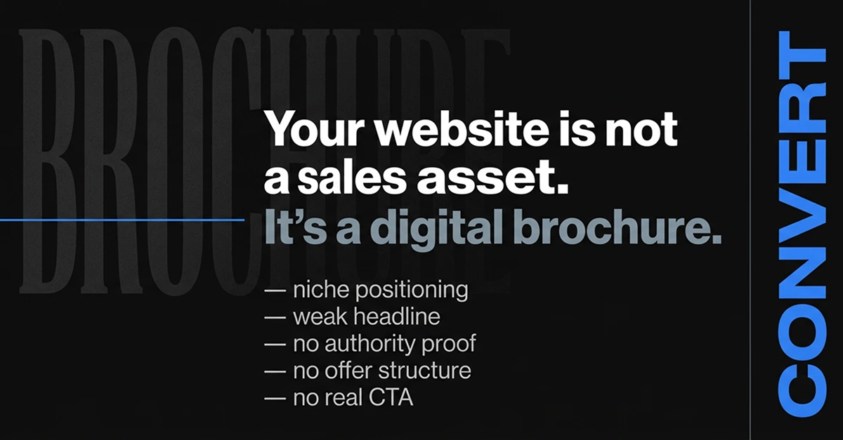
Your website is not just a sales asset, it serves as a digital brochure
Most consultants, coaches, and service-based founders have a website problem they do not know they have.
They spent money on it. They agonized over the colors, the fonts, the photos. They wrote a bio they are mostly proud of. They hit publish and waited for the inquiries to roll in.
They are still waiting.
The problem is not the design. The problem is not the copy, exactly. The problem is the fundamental purpose the website was built around.
It was built to look credible. Not to convert.
There is a massive difference between the two — and that gap is quietly bleeding your business every single day.
The Digital Brochure Trap
A brochure tells people what you do. A conversion asset makes people take action.
When most consultants build a website, they are unconsciously building a brochure. It describes their services. It lists their credentials. It might have a nice headshot and a warm "I'm passionate about helping people" paragraph. It ends with a contact form buried in the footer.
It checks every box for looking professional. It checks zero boxes for driving decisions.
The result? Your website becomes a place people visit to confirm you exist — not a place that does the heavy lifting of turning strangers into booked calls.
And so you stay dependent on LinkedIn DMs, referrals, and word of mouth. Those channels work, until they do not. They are not scalable, they are not predictable, and they put you at the mercy of timing and luck.
Your website should be your best salesperson. The one who works at 2am, never asks for a commission, and pre-qualifies your leads before they ever get to you.
Right now, for most of you, it is not doing that job.
Here is why.
Mistake 1: A Headline That Describes What You Do Instead of What You Deliver
The first thing a visitor reads on your homepage should stop them mid-scroll.
Most consultant homepages open with something like:
"Business Strategy Consultant for Growing Companies"
"Executive Coach Helping Leaders Reach Their Potential"
"Marketing Consultant for Service Businesses"
These are job titles dressed up as headlines. They tell the visitor what you are — not what changes for them if they hire you.
A conversion-focused headline leads with the outcome. It speaks directly to the transformation the right client is paying for.
Compare:
Weak: "Business Strategy Consultant for Growing Companies"
Strong: "I help 7-figure consultancies stop leaving money on the table by building systems that scale without the founder in every room."
One describes a category. The other describes a result, a client, and a specific problem. The right person reads that and thinks — that is me.
Your headline is not about you. It is about the moment your ideal client realizes they are in the right place.
Mistake 2: No Clear Niche Positioning
Trying to speak to everyone means you connect with no one.
Generalist positioning feels safe. It feels like you are keeping the door open to more opportunities. In reality, it makes you invisible to the exact people who would pay premium rates for a specialist.
When a consultant's homepage says "I work with businesses of all sizes across multiple industries" — it signals one thing: I have not made a decision about who I am best for.
Buyers do not want a generalist when they have a specific, high-stakes problem. They want the person who has solved that exact problem, for people exactly like them, more than once.
Niche positioning is not about limiting yourself. It is about making the right person feel like you built your entire business for them.
Ask yourself: if your ideal client landed on your homepage right now, would they immediately feel like you are speaking directly to their situation? Or would they have to work to figure out if you are relevant to them?
If it takes work, you have already lost them.
Mistake 3: No Authority Proof Where It Actually Matters
A testimonials page at the bottom of your navigation does not build trust. It buries it.
Social proof, credibility signals, and results need to live where buying decisions are being made — which is on your homepage, early, before the visitor has decided whether to keep reading.
Most consultant websites hide their proof. They have one or two testimonials on a separate page nobody visits. They list logos without context. They write vague claims like "proven results" and "trusted by industry leaders" without a single specific number or outcome attached.
Authority is not claimed. It is demonstrated.
Real authority proof looks like this: a short, specific case study callout on the homepage — "Helped a 3-person consultancy increase their close rate from 22% to 61% in 90 days." A quote from a recognizable client name attached directly to a claim you are making. A number that means something: clients served, revenue influenced, years of focused specialization.
If your homepage does not give someone a concrete reason to believe you within the first scroll, they are gone before they ever reach your contact form.
Mistake 4: No Structured Offer Breakdown
Confusion kills conversions.
If a visitor cannot quickly understand exactly what working with you looks like — what they get, how it works, what it costs, and what changes for them — they will not book a call. They will close the tab and find someone who made it simpler to say yes.
Most consultant websites describe services in vague, abstract language. "Strategic advisory." "Transformation programs." "Consulting engagements." These phrases mean nothing to a buyer who is trying to decide whether to invest their time and money with you.
A structured offer breakdown does not have to reveal your pricing publicly. But it does need to answer the questions a serious buyer is already asking:
- What exactly do I get?
- How long does it take?
- What does the process look like?
- What kind of result should I expect?
- Who is this built for?
Walk your visitor through the offer the same way you would walk them through it on a sales call. The goal is to have them arrive at that call already half-sold — not arriving cold with no context.
Mistake 5: A CTA That Asks for Nothing and Promises Less
"Book a call." "Get in touch." "Let's connect."
These calls to action are the digital equivalent of a shrug.
They ask the visitor to take action without giving them a single reason to do it now, today, with you specifically.
A strong CTA is specific. It tells the visitor what happens next, what they will walk away with, and why it is worth 30 minutes of their time.
Instead of "Book a call," try:
"Book a free 30-minute Website Audit — I will show you exactly where your homepage is losing buyers and what to fix first."
That CTA has specificity, a clear deliverable, and a compelling reason to act. It reduces friction because the visitor knows exactly what they are signing up for.
Your CTA is not a formality at the bottom of the page. It is the moment your website either closes or loses the lead. Treat it with the same strategic attention you give everything else.
Mistake 6: No Logical Flow That Guides a Decision
Every great homepage tells a story with a deliberate arc.
It opens by agitating a problem. It builds credibility. It presents a solution. It handles objections. It closes with a clear action.
Most consultant homepages are a collection of sections that exist independently, in no particular order, without a guiding logic connecting them.
A visitor should be able to move from the top of your homepage to the CTA feeling like they have been walked through a carefully considered argument — not like they have been handed a pile of information and told to figure it out themselves.
Think of your homepage the way a good salesperson structures a conversation: first earn attention, then build trust, then make the case, then ask for the meeting. Every section should be in service of moving the visitor one step closer to that final action.
Why This Keeps You Trapped in the DM Cycle
When your website does not convert, you compensate.
You post more on LinkedIn. You send more DMs. You rely on referrals to keep the pipeline from going dry. You do the work manually that your website should be doing automatically.
This is exhausting. It is also a ceiling.
The consultants and coaches who build real leverage in their business are the ones who have a website working in parallel with their outreach — warming leads, pre-qualifying buyers, and doing the positioning work before the first conversation happens.
When someone lands on your homepage and it immediately communicates: I understand your problem, I have solved it before, here is exactly how I can help you, and here is the next step — that person arrives at a sales call ready to move forward.
When they land on a brochure, they arrive at a sales call needing to be educated from scratch. Or they do not book at all.
The DM hustle is not a strategy. It is a symptom of a website that is not doing its job.
What a Real Conversion-Focused Homepage Looks Like
A homepage built to convert is not complicated. It is clear, structured, and deliberate.
It opens with a sharp headline that leads with outcome and speaks to a specific person with a specific problem. It immediately signals niche and credibility — who you help, what changes for them, and why you are the right person to deliver that change.
It surfaces proof early — specific results, recognizable names, concrete numbers — before the visitor has a chance to doubt whether you are worth their time.
It walks the visitor through the offer in plain language. No jargon. No vague descriptions. A clear picture of what working together looks like and what they can expect on the other side.
It handles the unspoken objections — the "is this for someone like me?" and "is this worth the investment?" questions every buyer is asking internally.
And it closes with a CTA that is specific, low-friction, and high-value. One clear next step. No confusion about what to do or why to do it now.
That is not a brochure. That is a conversion engine.
The Question Worth Sitting With
Your website is live right now. Someone could be reading it at this exact moment.
What is it telling them? Is it making the case for why you are the right person for their problem? Is it building trust, establishing authority, and guiding them toward a decision?
Or is it simply confirming that you exist?
Because if it is doing the latter, you are not just losing traffic. You are losing clients who were already looking for exactly what you do — and found someone else whose website made it easier to say yes.
The good news is that this is fixable. Not with a full redesign. Not with a new brand. With a clear strategy, a sharper message, and a structure built around conversion rather than aesthetics.
Your website should be the hardest working member of your team.
Is it?
If you are a consultant, coach, or service-based founder who wants to turn your website into a real conversion asset, let's talk. Book a free audit and I will show you exactly where you are losing buyers — and what to do about it.
Ceyonra Team
Helping businesses scale with software.